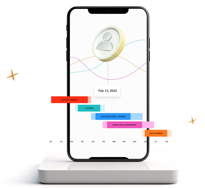
Youth Digital Gateway, a project through ESDC, was looking for some senior direction to help their UX team define the visual language and flow of their product. I was engaged to provide a heuristic evaluation on the existing prototype, enhance the user experience, and work with the UX team to establish a visual language and design system.
Following some stakeholder interviews and baseline user testing we set out to define repeatable patterns for the product and ensure UX best practices were adhered to.
This was one of the Prime Minister’s Office projects so it was important that deliverables were of the highest quality.
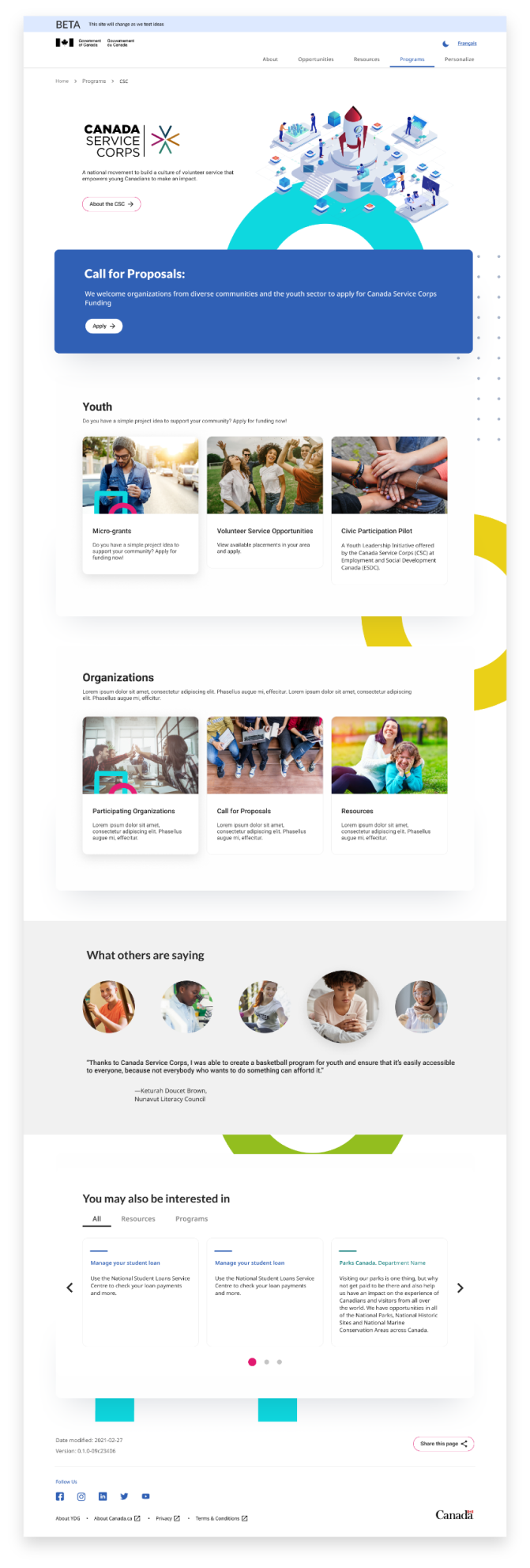
Creating an interface that appeals to a broad range of ages (ranging from students to working professionals) meant developing a simple and engaging content experience. To make components stand out, we used colour and motion.

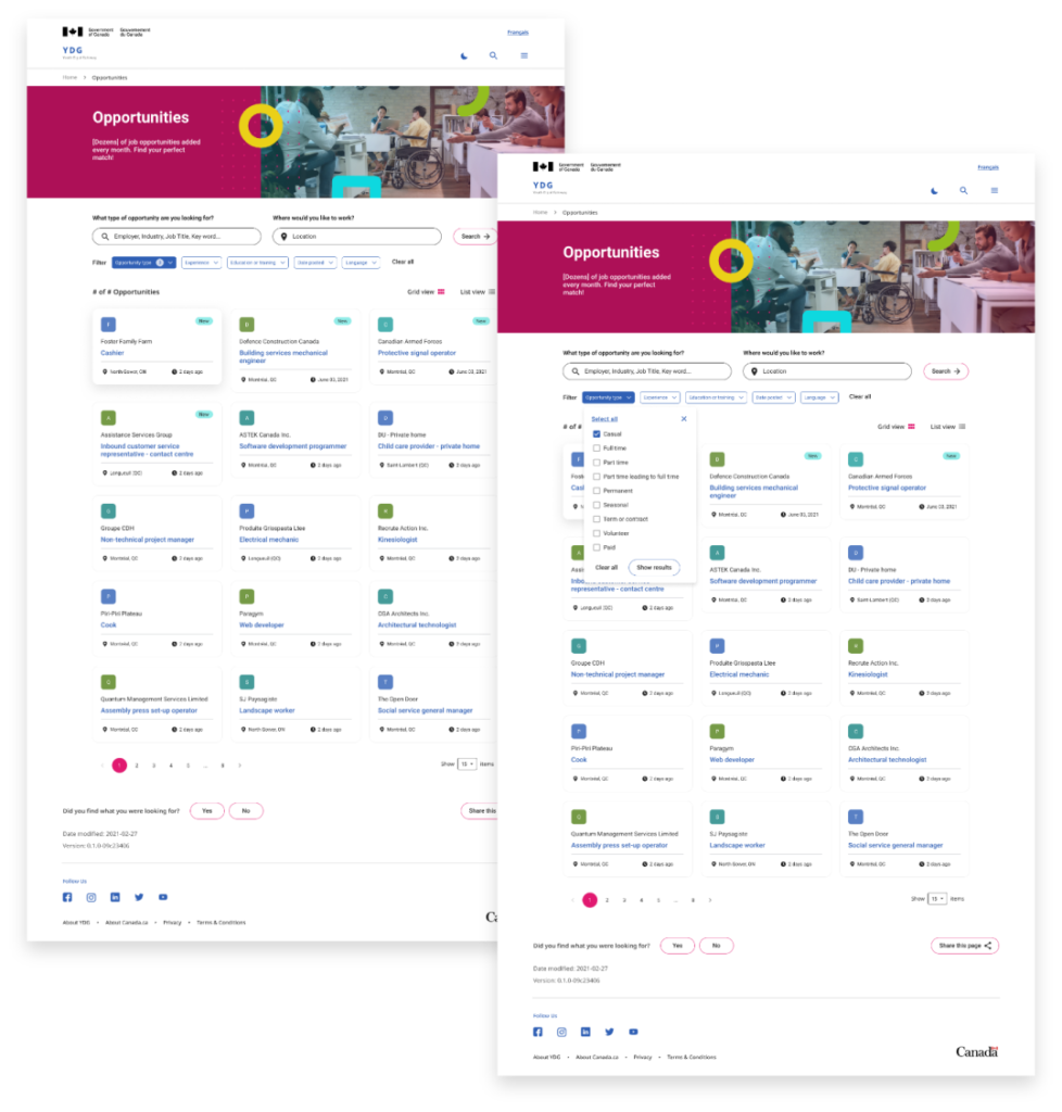
Youth Digital Gateway’s advanced search function was rigorously tested to ensure it provided a robust search experience similar to those used in e-commerce.

This project allowed for some deviation from typical government standards. Though, many components referenced WET standards and the Canada.gc.ca style guide.


Including AA accessibility standards, other considerations included screen readers, and a custom accessibility panel that gave the user the ability to control contrast, font size, and image rendering.
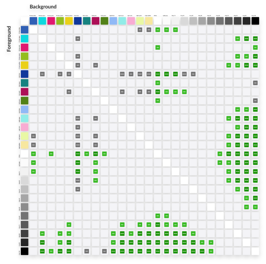

I worked with the internal UX team to build a design system in Figma. The design system included an atomic approach to components, a visual style guide, and page templates.
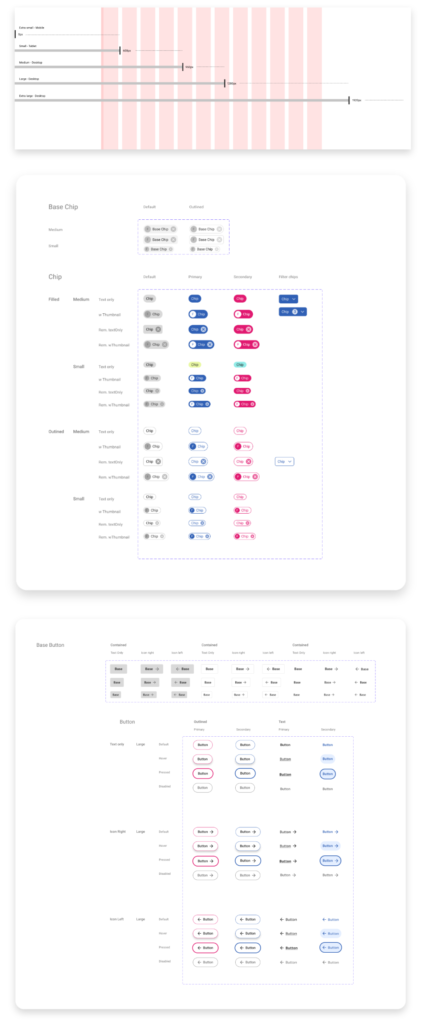
The Youth Digital Gateway project exemplifies the power of UX best practices and a cohesive visual language. The heuristic evaluation and design support led to an 85% increase in user satisfaction and a 55% improvement in task completion efficiency. Stakeholder interviews and user testing proved invaluable in meeting high standards. This success underscores the significance of user-centered design in product development.
